Arch102

Time for Jury🤕👌🏻😊😂

After the long study term, I completed my drawings and the construct. It was a long time period. I produced a different construct which has a different strategy than the others I had done till the jury.( You can see the other project my older posts.) This was so risky. 🤫However, I did it, because I had some better design ideas than the other ones. The new one had an overall composition, variations, and exception as well as some rules in itself.

In my new idea, there should be contrast quality in spaces and they should follow each other in the same spaces. Thus, Before I started the construct, I had decided some contrast qualities and improved them. These are;

Close❌Open: These means that spaces are open or close in terms of relations between the other spaces

Individual❌Group: These means that who can experience the spaces.

Invisible❌Visible: Visual relationship between hans. (With other spaces and in itself)

Low❌High: Quality of spaces in terms of limitation(small or large space)

Smoot❌Uneven: These refer to quality of texture. Hans can experience the texture quality in ground or side(in variations)

Linear❌Planer: these means that what is the proportion of spaces.

These are all variations in contrast spaces. When I applied them to construct, I merged some of them. To give an example, A space can be linear to planer and than group to individuals. Also, it can be more than 2.img_0788-1

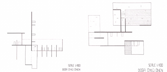
In term of visual relationships as I said it can be visible or unviable. It means that in all variations, hans can see or can’t see the other hans. That’s why I decided to study visual relationships in exception part. In exception part, whole quality was same in terms of space quality. However, in visual term, transparency level of visuality changes gradually. I produced it thanks to semi transparency elements.

img_0757

❗️In Jury, almost all of them works. However, in exception part, according to Jury critics, It should have more relationships between the other variations. It had less relationships.❗️

Arch112

Exploded Section Drawing👀 What??? 🤨

It is also Olson Kundig’s design as I mentioned in my older posts.

This is the Exploded Section drawing. It is a kind of combination of section and axonometric drawing. As we did in section drawing, it is cut from the important parts where we want to show its detail. Also, we again hatched cut parts.

The detail parts were stairs and fireplaces in the Whistler Ski House 🏡. As you can see in the drawing, these parts were shown. There is a difference between these two, to show the stairs, the wall was cut and the wall was hatched. On the other hand, to show the fireplace, it is a mass and the area which was cut was hatched. Also, the most significant thing was the window of the building. Thus, ✏️I drew almost all detail of the windows.

Arch112

Plan Drawing ✏️🤯

That I mentioned in my previous post, we are assigned to draw plans of Whistler Ski House.

The building has 2 floors and we drew both. The drawings include walls as well as kinds of stuff which are inside of the building. It also contains hatching because it is like a section from the front view. As we know 🗒hatching was the most significant part of the drawing. Not only the line quality but also color of it was important. Also, the hatching should be smooth in every part of the sections.

🤯What is difficult for the drawing is that there is much detail like window mechanism and stuffs part. 🖍

Arch112

Whistler Ski House 🏡

In the studio, we are assigned to explain and draw the variety of buildings. Whistler Ski House was given to me and my group friends. We prepared a presentation which involves many information and photos. I will share some of them.img_0629Location🔻Whistler, CanadaDesign PrincipalTom KundigSet in the Coast Mountains of western Canada, Whistler Ski House is a family retreat built to withstand the harsh mountain environment. Elevated ten feet above grade, the main level provides a sense of occupying the tree canopy while also floating above snowdrifts and flood-prone lakeshore.You can find many information about it on their website.🌎 http://www.olsonkundig.com/projects/whistler-ski-house/

This was a different experience so that we investigated almost all part of the building from the website and also from the Tom Kundig’s Book from our library which is in Ted University. In addition to that it was gained me many experiences. It makes me to look different architectural perspective to the building and also the other ones.👀

Arch102

Sketches of Human Experiences 🖍

During studying, We generally start with the construct and try to apply our ideas to construct. Nevertheless, in this time, we started from sketches and we will continue with constructs. 📝These are my sketches.

When I drew these sketches, I was careful about human experiences. How do human experiences change and how do the variety of human experiences increase. According to that spaces was chance. I tried to create some variations to apply them to the construct. These variations involve public and individuals spaces, high and narrow spaces as well as change between these spaces. Also, in a continuous space, it includes how can people experience differences. In addition to that, different than the other contract, I plan to study with mass and can create some individual spaces by using mass.📜

Arch112

First Portfolio Experience 🍼

What will portfolio involve? It will involve my whole studying during school and career lives. We started from organization part. It means in which part will include photos, drawings or texts. Also, covers and index part will design.

Firstly, I studied to find a logo for me. I had drawn many.  At the end of it, I decided the logo which there is in the portfolio.

In the first page of it, This page includes the logo, texts which are “portfolio” and my name. I created lines which are referenced from the logo. Also, the lines separate the paper some parts. I used baby blue to emphasize titles in two of the parts.😊👶🏼 img_0225

In the Index part, big numbers were located by referencing from the diagonal line. Also, which part involves what was written right parts of the numbers.img_0226

This is an example of how portfolio continue. There are some photos and text. They are separated from each other by the diagonal line.❕ According to some feedback in our studio, I will change the font size of the text, because it was so big than common. On the other hand, keywords on the photos should be bigger than it. In addition, the diagonal line can be boring on every page as well as my name. ❕

img_0227-1

In the last page of it, the logo covered almost half of the page. The other part, my contact information was written.

img_0229

These were an organization of my portfolio. I hope you like it. I will change some of the things there. Thank you. ♥️